title

Parinaz Kassemi
Digital Designer
Click to unlock
Preparing desktop…
Four projects covering a self-built mobile web app, a new product launch, AI product design, and my Figma-to-Framer web design process. Choose one from the side tab to open the full write-up.
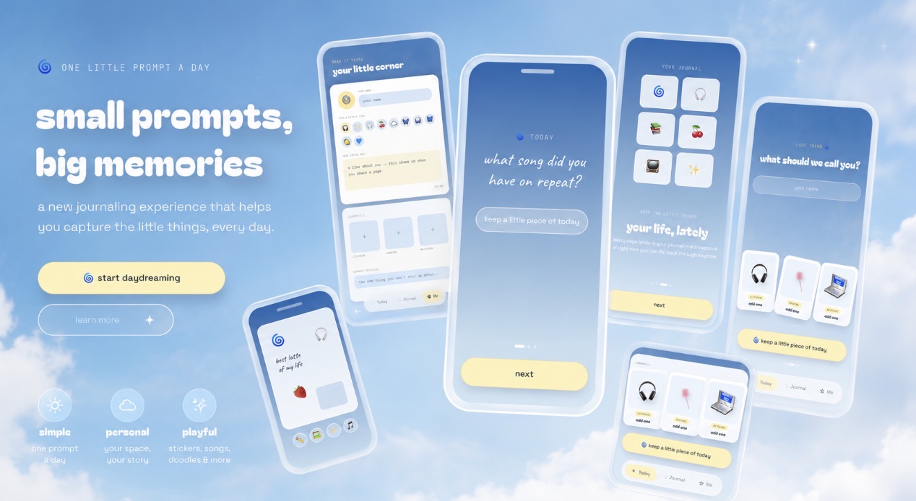
A mobile journaling experiment about self-expression, thoughtful consumption, and creating something just because it’s delightful to use.
Daydreamz is a mobile-first journaling app built around one small prompt a day. I designed it in Figma and built it in Lovable as a product experiment — extending the ideas behind my portfolio into a new space, one centered less around my own work and more around giving other people a place to express themselves.
There’s no larger business plan behind it. It’s a thought experiment, built to be used, played with, and enjoyed.
My portfolio was submitted for several design awards, which brought a lot more attention and interaction to it than I originally expected.
It’s designed as an interactive desktop, so there’s already quite a bit to do: people can leave sticky notes, drop stickers, name their cursor, and move through the space alongside other visitors. I wanted visiting it to feel less like scrolling through a collection of work and more like spending time somewhere — with small, delightful experiences built into the space for people to discover.
But ultimately, a portfolio is still a space for me to express myself. Daydreamz started with the idea of extending that experience outward.
A lot of our time online is spent consuming things other people made. I was interested in creating a different kind of interaction: something that could begin with thoughtful consumption but eventually invite you to make, answer, decorate, or leave something of your own behind.
One question a day. Answer it or don’t. Add a photo. Drop a sticker somewhere. Draw something. Save the song you keep playing. Write down what you’re reading or watching. The goal isn’t productivity — it’s expression.
Daydreamz opens with a single question about your life — what song did you have on repeat? what made you laugh today? what are you looking forward to? You can answer it, skip it, or come back later.
Around the prompt is a small space you can make your own with stickers, photos, songs, doodles, a line about yourself, and whatever you’re currently listening to, reading, or watching. Over time, those little pieces start to become a record of what your life felt like — without requiring you to sit down and document all of it.
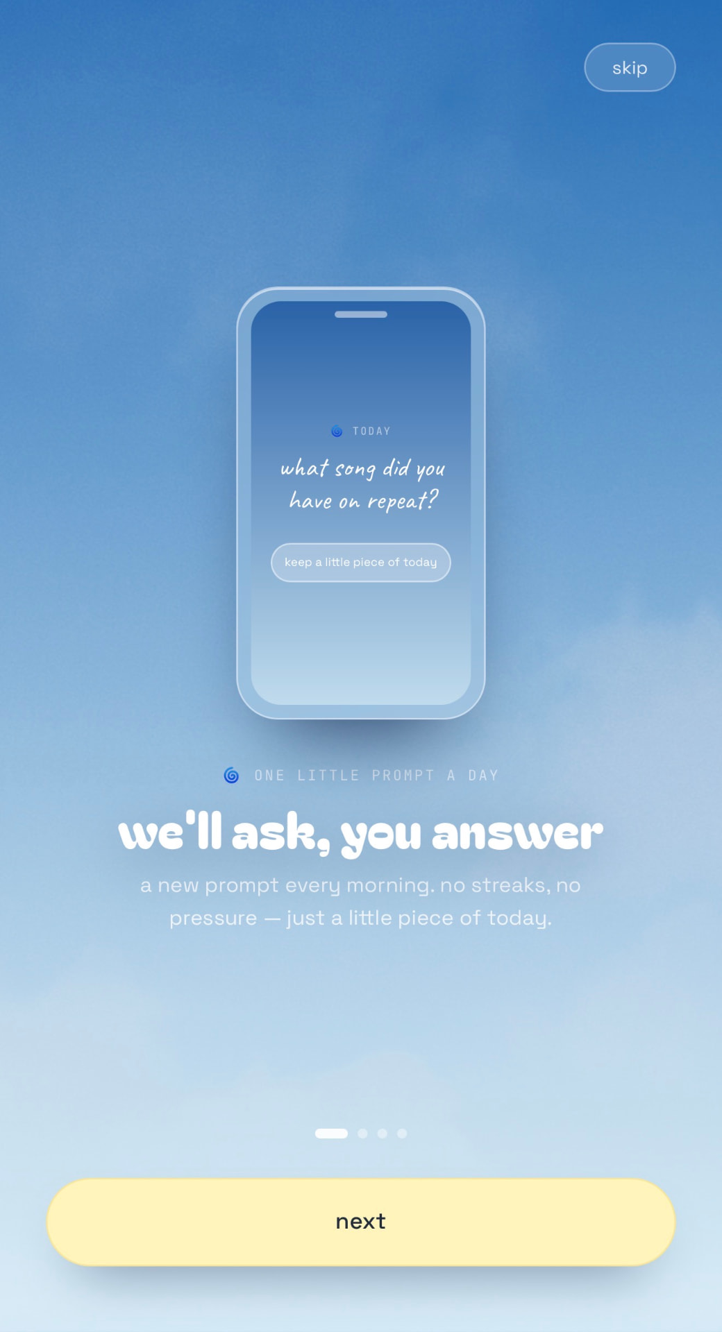
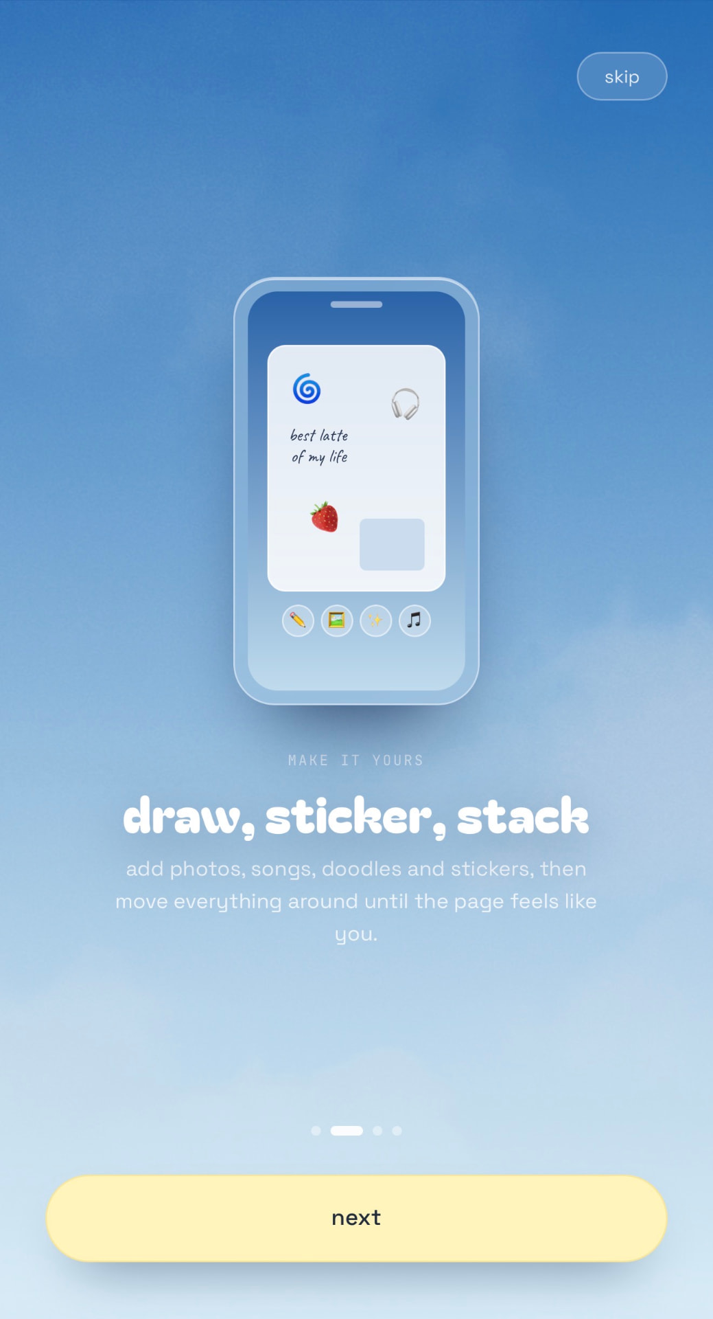
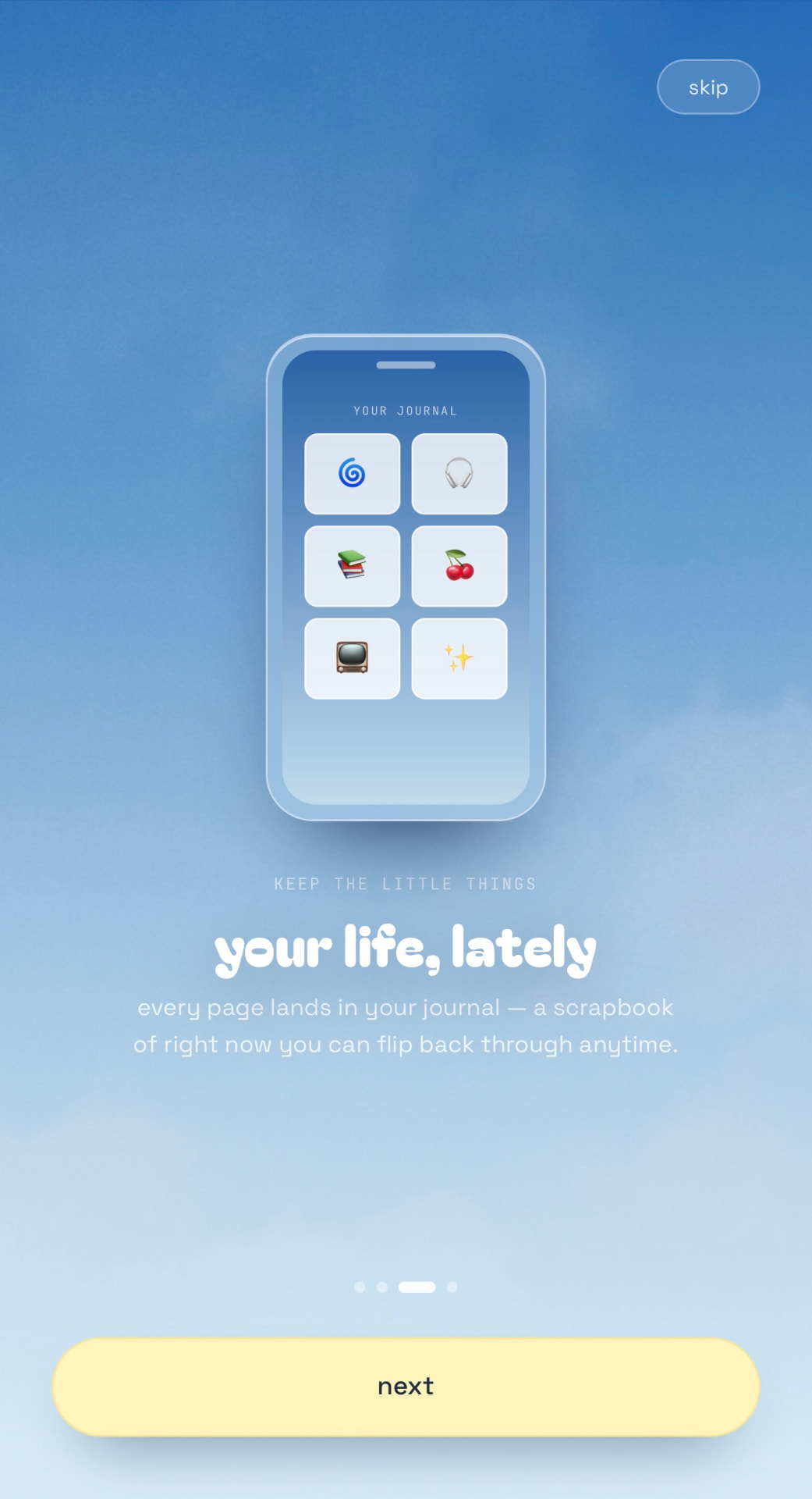
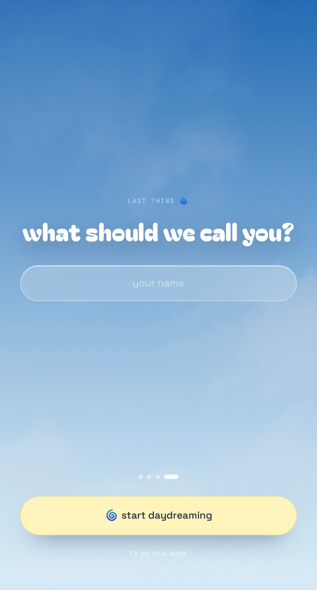
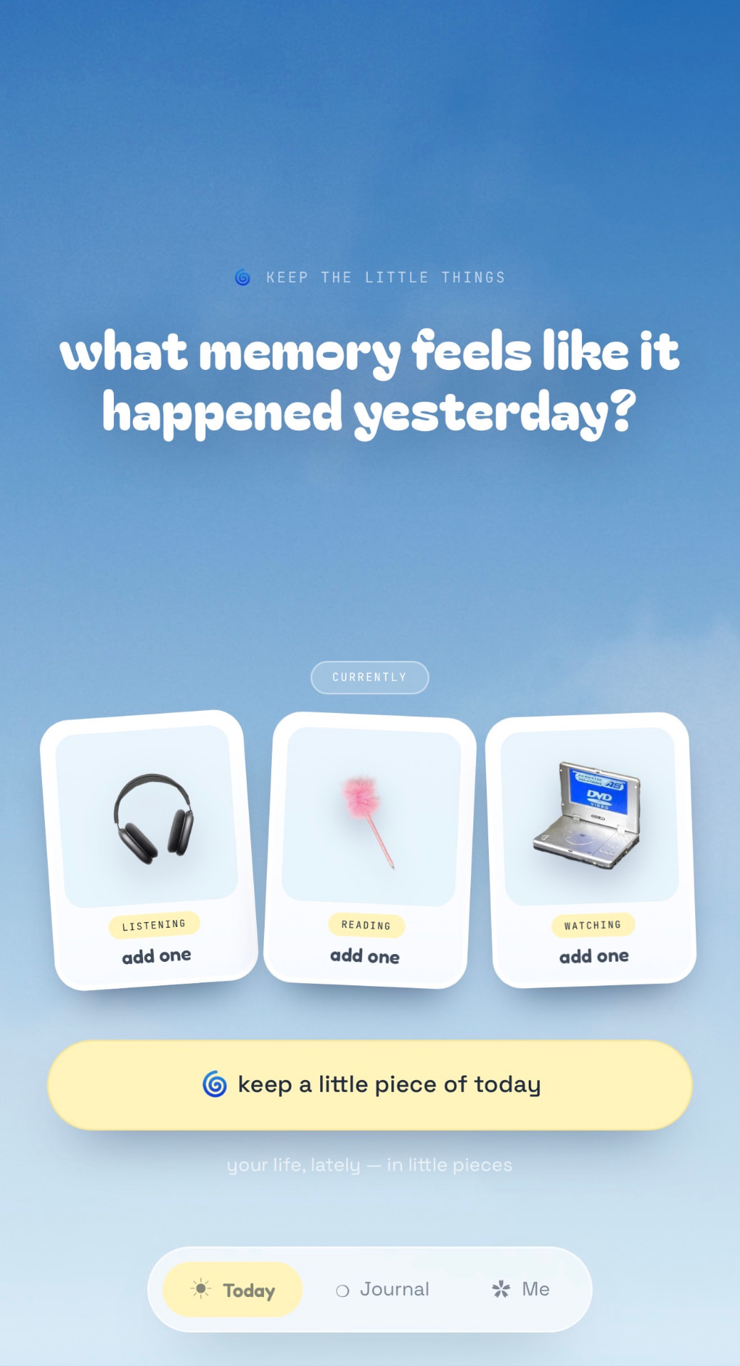
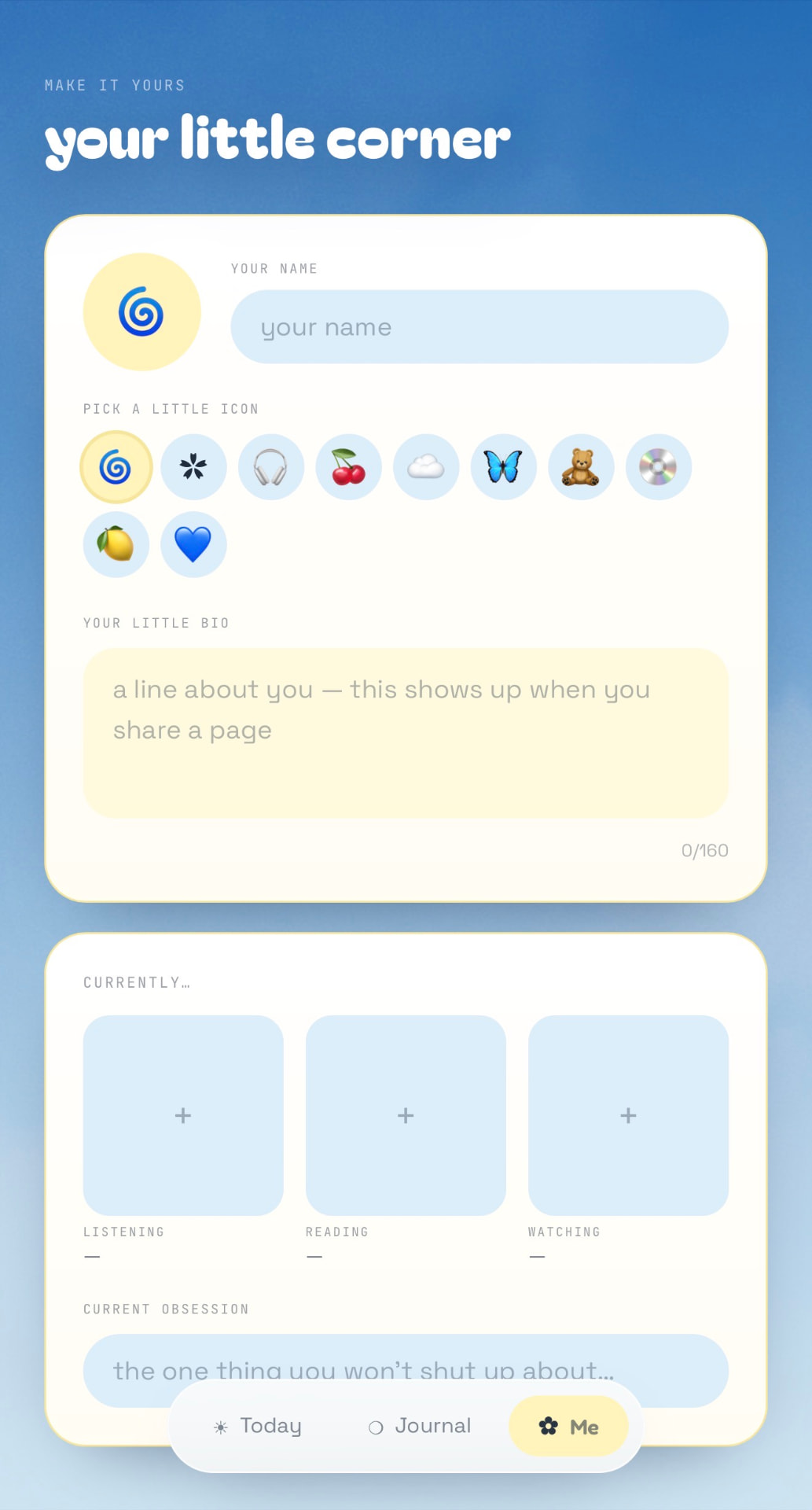
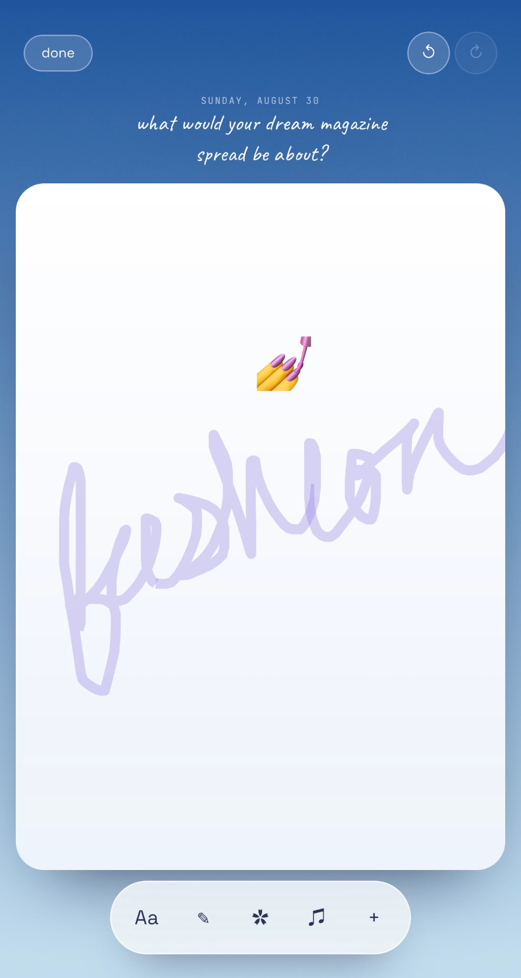
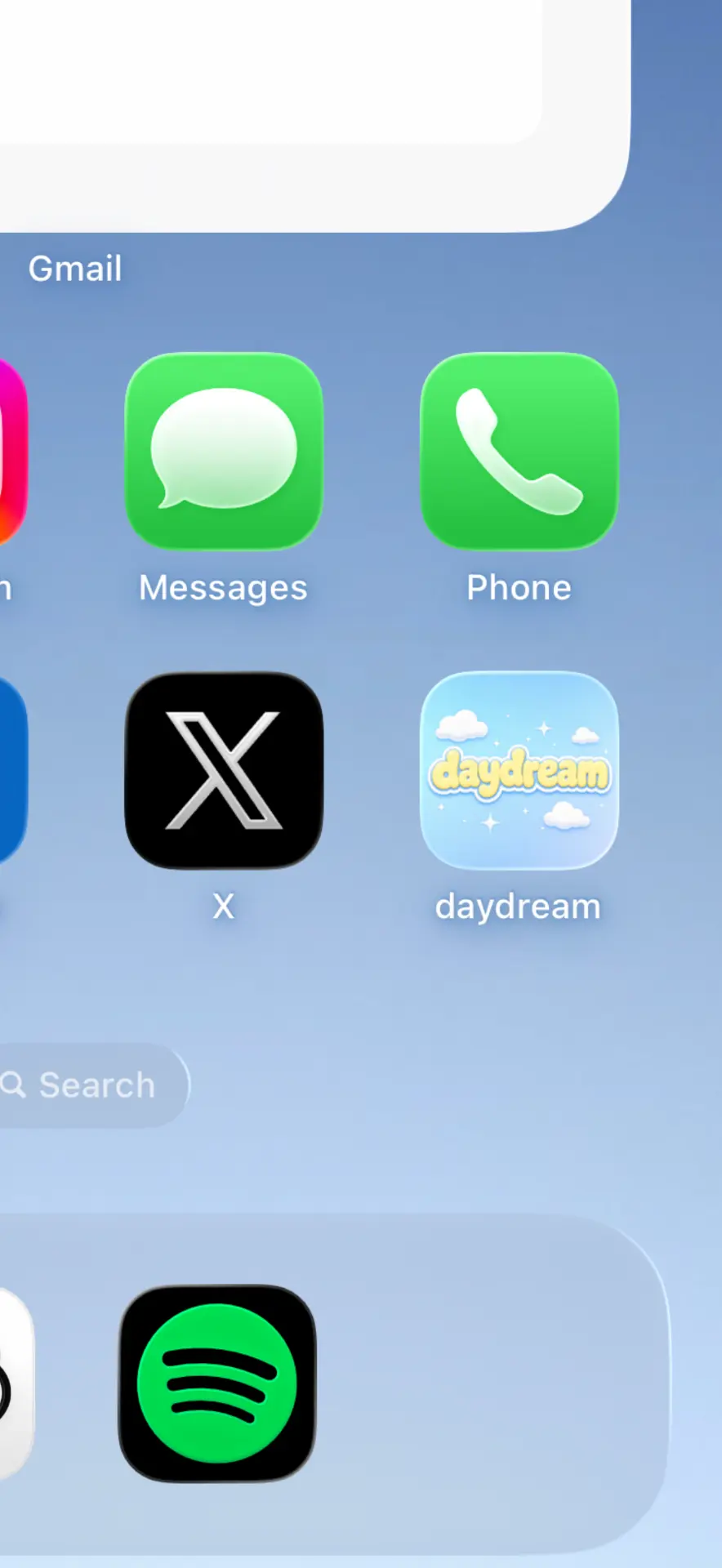
The interactions are small and casual, so Daydreamz should be something you open whenever you have a thought — not something that requires sitting down at a computer.
Blue gradients, rounded type, a butter-yellow accent, and lots of open space. Connected to the playful world of the portfolio without recreating it. More like looking out a window than opening another dashboard.
No streaks to maintain, no pressure to complete an entry. The language follows: “keep a little piece of today,” rather than “complete today’s entry.” Forget about it for three days and nothing has been lost.
Daydreamz is intentionally a thought experiment. There’s no roadmap toward monetization and no larger plan to turn it into a journaling company. Its purpose is much closer to the portfolio it came from: make something thoughtful, put it into the world, and give people an interesting way to interact with it.
The portfolio begins with my own expression. Daydreamz extends that idea by giving some of that space back to the person visiting it. For someone who finds my portfolio, enjoys spending time there, and wants to keep exploring, Daydreamz becomes another little world they can step into — except this time, it’s theirs.
It’s live, it’s still changing, and that’s really the point.
Try it on your phone →
How I take a website from an initial desktop concept in Figma to a responsive, built site in Framer.
I design JNPR.LABS templates from initial visual direction through responsive implementation in Framer. This project shows how I translate a visual concept into a system that can be built.
The visual direction started with imagery, then expanded into typography, color, spacing, and grid rules that carry across the site.
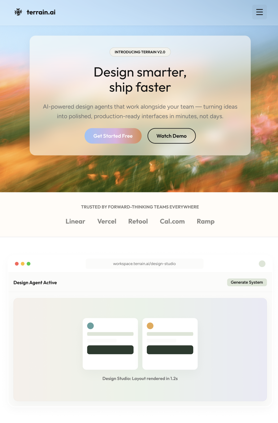
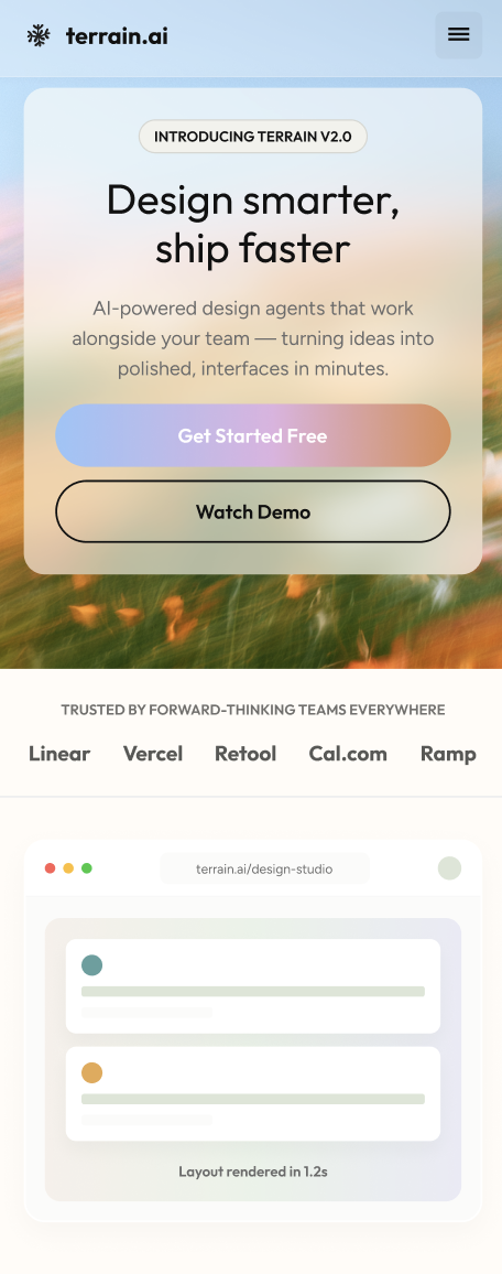
Desktop, tablet, and mobile layouts are built on a shared grid and annotated where responsive behavior, sizing, states, or component changes need to be explicit.
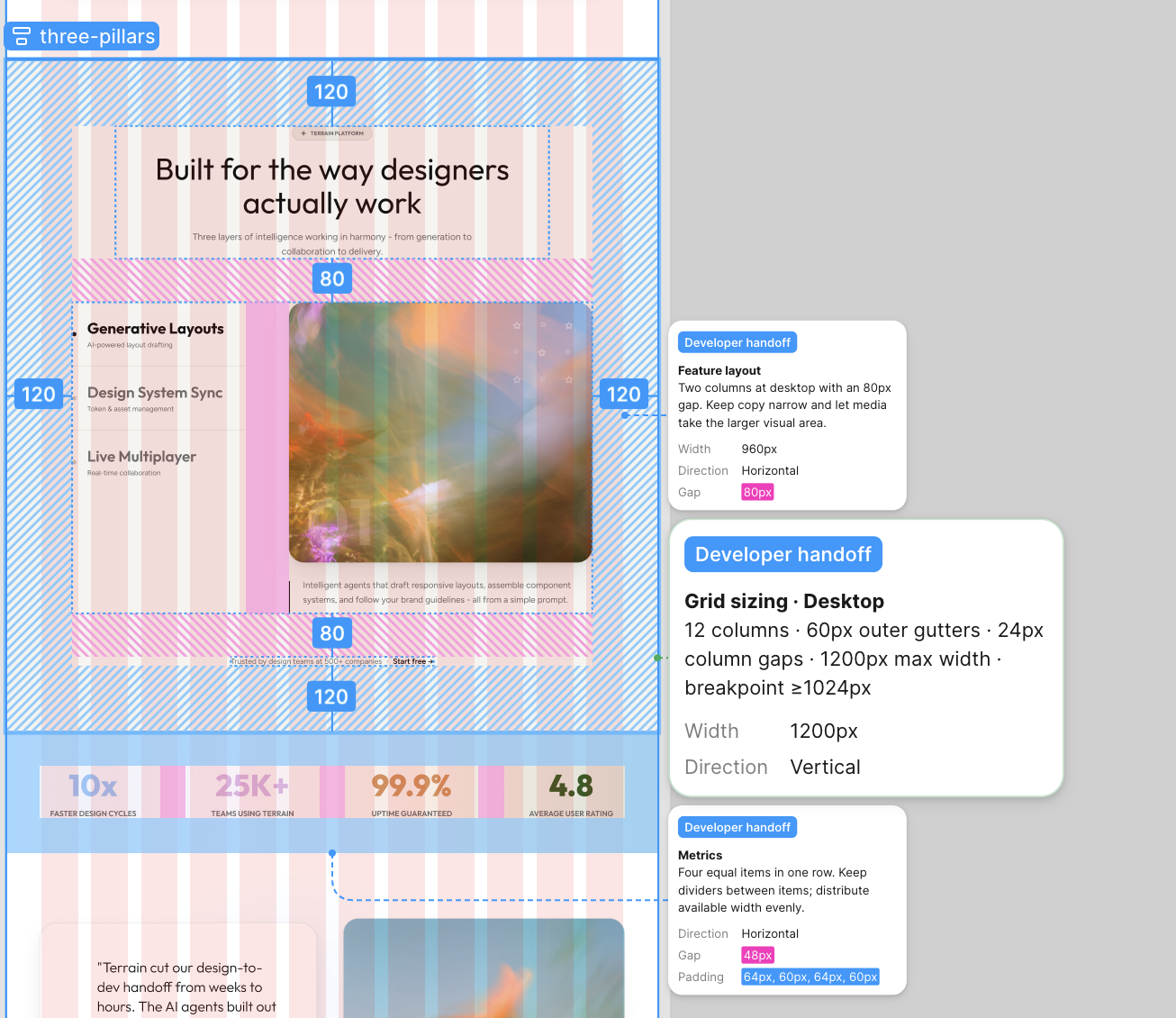
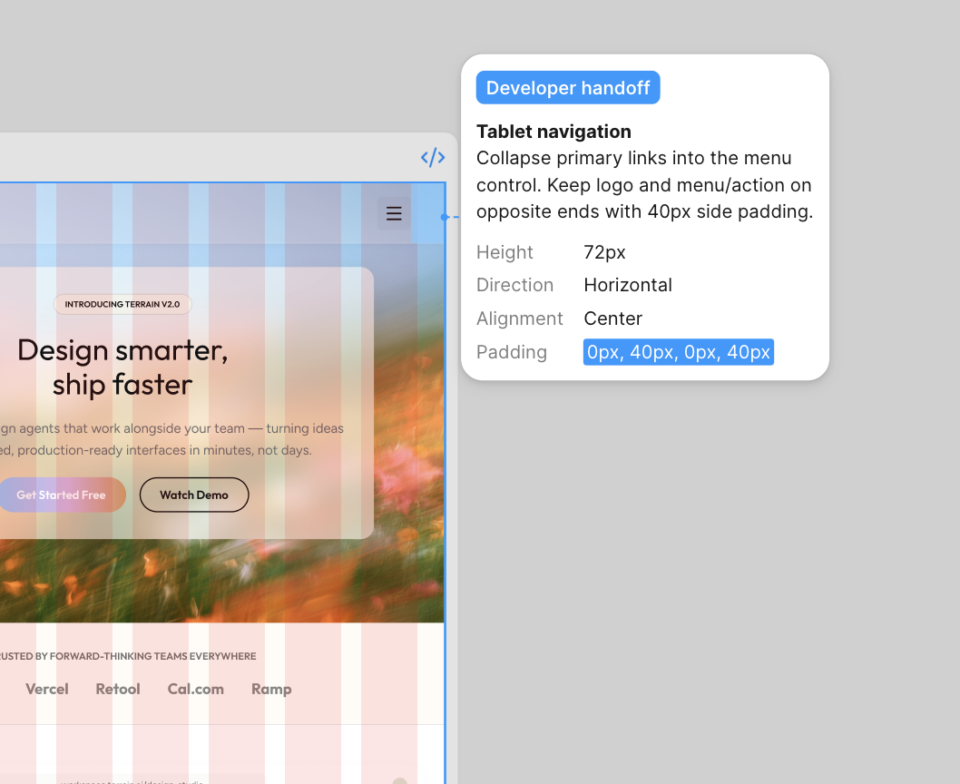
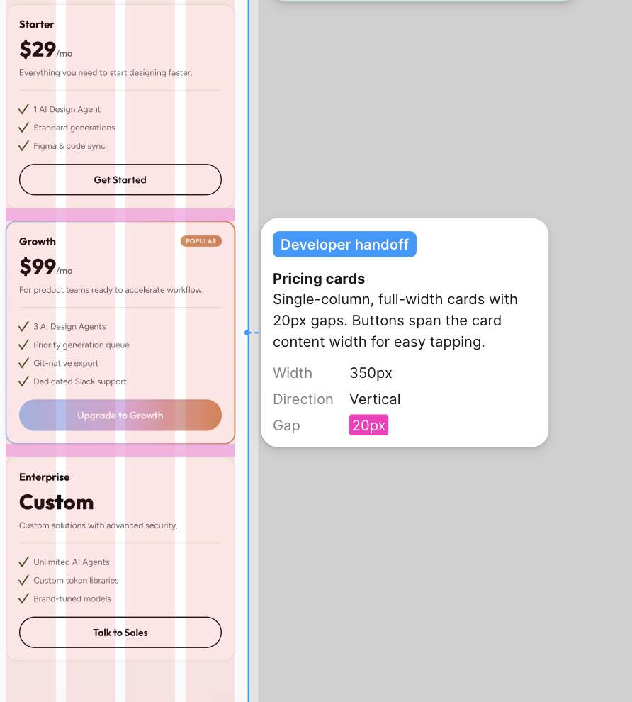
For this project, I handled implementation in Framer, carrying the responsive system from Figma into a working site and refining it in the browser.
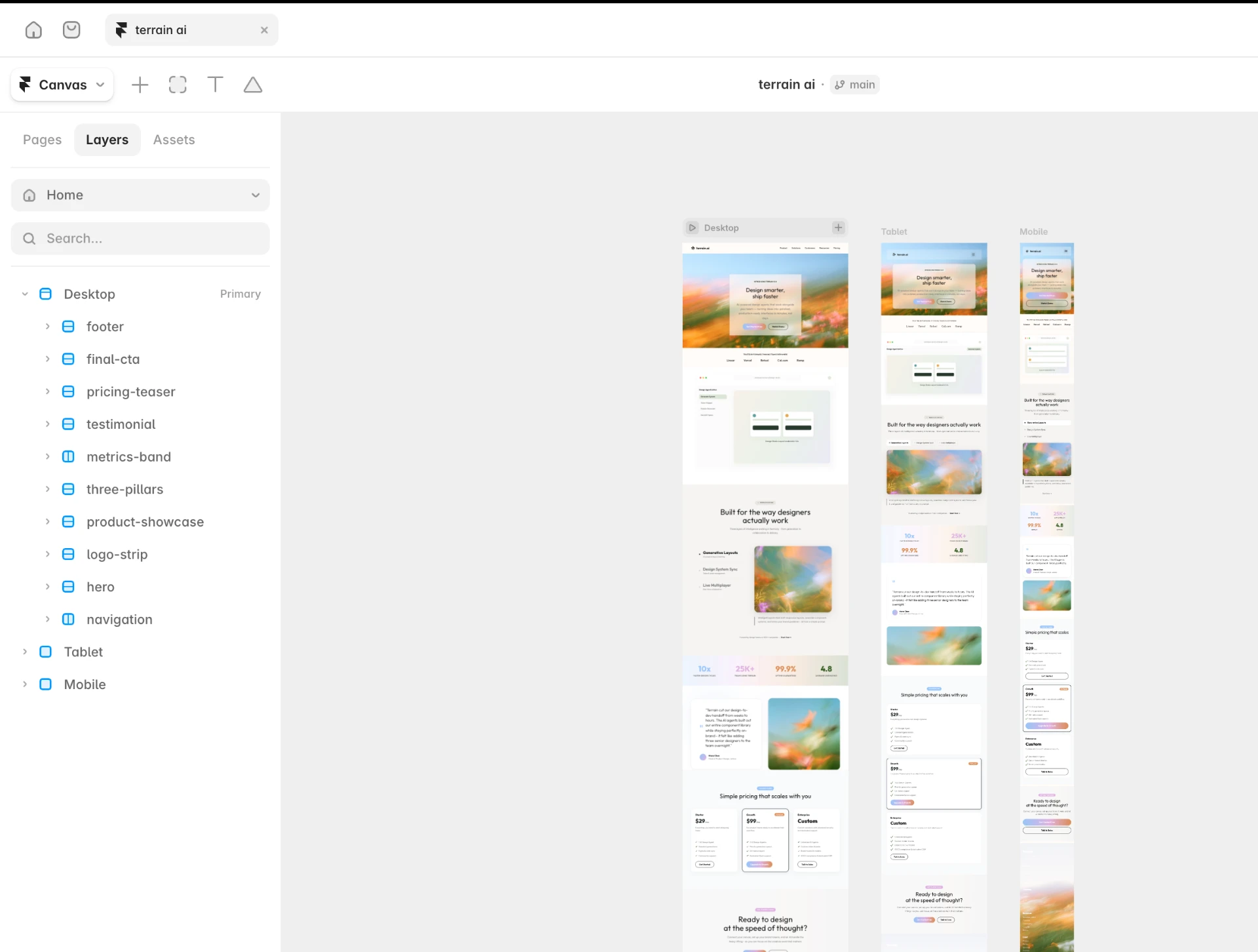
The final site carries the same visual system across desktop, tablet, and mobile.
Designing an AI concierge for a complex wellness ecosystem.
Life Time had evolved far beyond a traditional fitness app. Members could book classes, reserve childcare, browse articles, shop products, register for events, and access hundreds of services — all within a single experience. As the platform continued to grow, discovering information became increasingly difficult, resulting in high volumes of repetitive questions for the in-house concierge team.
At the same time, Life Time was preparing to launch an AI-powered assistant and expand the app beyond members. I joined the initiative to lead discovery efforts that would help define how an AI concierge could become a more intuitive way for users to navigate the ecosystem.
Although the app offered hundreds of valuable services, they were distributed across many different business units and navigation paths. Members frequently contacted concierge staff with simple questions like:
The information often already existed inside the app — it simply wasn't easy to find. The challenge wasn't creating more features. It was creating a simpler way for people to access the ones that already existed.
Twelve service areas each owned their own corner of the app, and each corner had its own logic for how things were named, grouped, and found. A member with a single question had to guess which business they were asking.
That mapping is what made the case for a conversational layer: not another destination, but a way through all of them.
To understand both user needs and business priorities, I led discovery across multiple groups.
I interviewed concierge teams to understand the questions they answered most frequently, where members experienced friction, and which interactions consumed the most time. This helped identify opportunities where AI could provide immediate value by handling repetitive, informational requests.
Life Time encompasses numerous businesses — including fitness, childcare, retail, events, classes, and editorial content. I facilitated workshops with leaders across these business areas to understand what information their customers searched for, which services they wanted surfaced, and how AI could support their unique experiences.
I evaluated conversational AI experiences, including ChatGPT and digital banking assistants, to understand interaction patterns, conversational structure, and approaches for handling uncertainty and unsupported requests.
The most useful finding was where everyone was weak: almost nothing handled its own limits gracefully. That became the space worth owning.
| Pattern | Coverage across products | Take |
|---|---|---|
| Suggested starter prompts | Adopt | |
| Streaming, conversational tone | Adopt | |
| Deep links into existing features | Differentiator | |
| Explicit "I can't help with that" handling | Gap to own | |
| Handoff to a human | Required |
The research revealed three patterns that shaped every decision that followed.
Using the research findings, I developed the artifacts that shaped the conversational experience: journey maps, conversation flows, intent mapping, prompt libraries, and edge-case scenarios.
L·AI·C didn't exist yet — there was no interface to redesign. The first artifacts were conversations on paper: what a member would say, what a good answer looked like, and where each answer should lead next.
Special attention went to how the assistant should respond when a question fell outside its capabilities — keeping the conversation useful while maintaining trust.
Every dead end resolves into a next step, so a limitation never reads as a failure.
The project established a research-backed foundation for Life Time's AI concierge. By aligning customer needs, concierge workflows, and business priorities, the work helped define how conversational AI could improve information discovery while supporting the long-term goal of reducing repetitive concierge requests.
The experience strengthened my understanding of designing for AI — not as a replacement for traditional interfaces, but as a new interaction layer that simplifies access to complex systems.
This project reinforced that successful AI experiences begin long before interface design. Rather than starting with technology, we began by understanding people: what they asked, where they struggled, and how they naturally sought information. Those insights became the foundation for designing a conversational experience that served both users and the business.
Scaling a growing fitness content library.
Life Time's On Demand platform was rapidly expanding. With a new production studio, the business was preparing to release hundreds of high-quality fitness classes across yoga, strength, cycling, Pilates, meditation, and more. The existing experience wasn't built to support that scale.
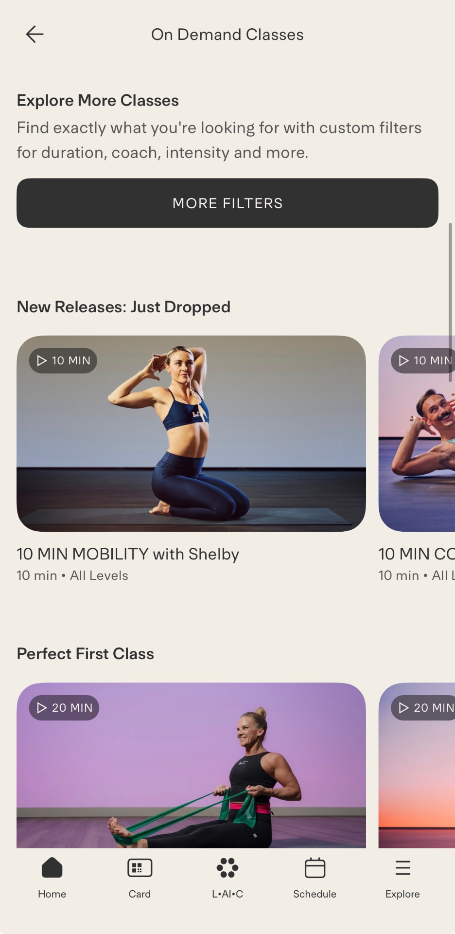
Members were presented with a continuous feed of videos, making it increasingly difficult to discover relevant content as the library grew. I led the redesign of the On Demand discovery experience, balancing immediate business needs with a long-term product vision that could scale alongside the platform.
The On Demand experience had outgrown its original design. As hundreds of new classes were added, users were expected to browse a single, continuously scrolling feed to find workouts. While this worked for a smaller library, it became increasingly difficult to discover content as the platform expanded.
At the same time, the organization faced competing priorities. The brand team was preparing a company-wide rebrand, while engineering resources were focused on rebuilding the broader Life Time app. The challenge became finding a solution that improved discovery immediately while creating a roadmap for a more robust experience in the future.
One feed, no shape. Every class occupied the same visual weight, so a member with fifteen minutes and a specific instructor in mind had the same path as someone with no plan at all — scroll until something looks right.
The library was about to more than double. Scroll was the only tool, and it was already the bottleneck.
I began by understanding how members searched for fitness content and how other digital fitness platforms approached discovery.
| Pattern | Coverage across platforms | Take |
|---|---|---|
| Search | Expected | |
| Filter by duration | Adopt first | |
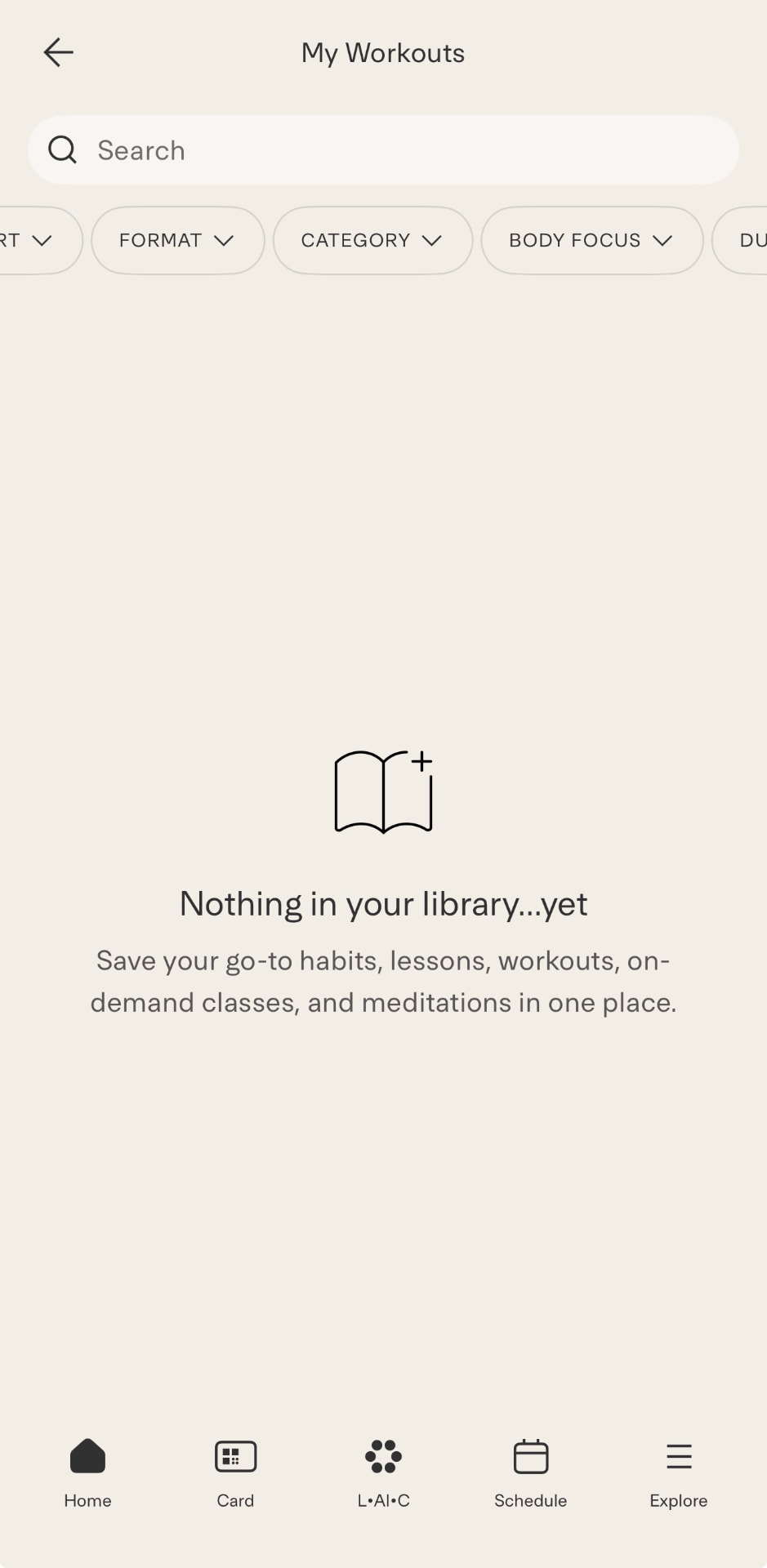
| Bookmarking / save | Adopt | |
| Personalized recommendations | Long-term | |
| Category organization | Phase one |
I conducted interviews to better understand how members chose workouts, what information influenced their decisions, and where they experienced friction while browsing the existing library.
I evaluated leading fitness and streaming platforms to identify common discovery patterns, including search, filtering, bookmarking, personalized recommendations, and content organization. This research helped establish which interactions users already expected and where the current experience fell short.
Three themes emerged consistently throughout the research.
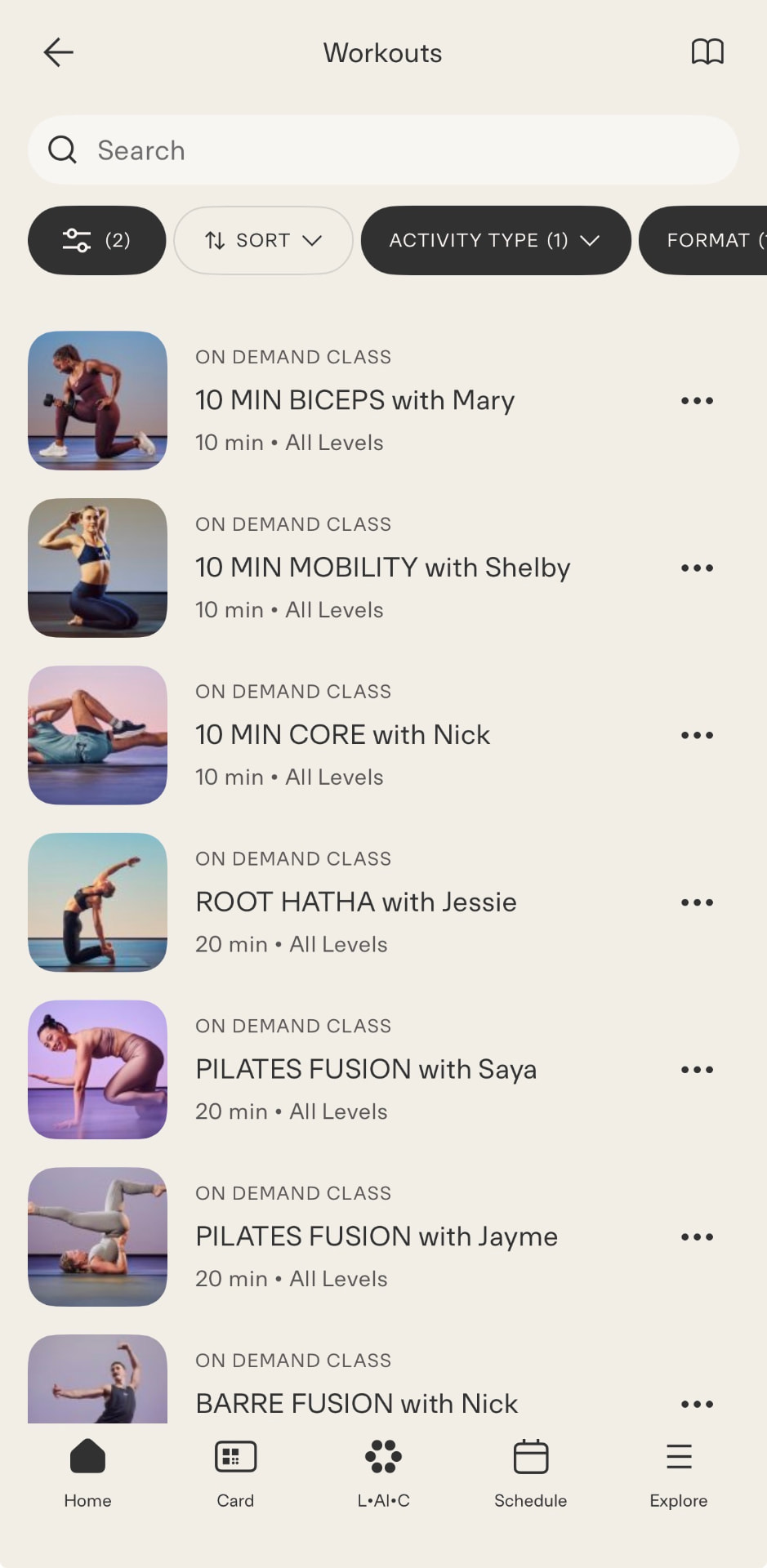
Based on these insights, I proposed a phased product strategy. To quickly improve discoverability, I introduced lightweight category filters that organized the growing content library without requiring significant engineering investment.
This provided members with an immediate improvement while aligning with existing technical constraints — a design that could ship inside the capacity the team actually had.
Together, these features created a foundation that could continue supporting the platform as the content library expanded.
I collaborated closely with engineering and business stakeholders so each recommendation balanced user needs with technical feasibility and organizational priorities.
The project established both an immediate solution and a long-term product vision for On Demand. Rather than waiting for engineering capacity to build every feature at once, we introduced an incremental approach that improved content discovery while creating a clear roadmap for future enhancements.
The experience reinforced the importance of designing products that scale — not only for users, but for the organizations building them.
One of the most valuable lessons from this project was recognizing that good product design isn't always about delivering the ideal solution immediately. Sometimes the best outcome is creating a strategy that balances user needs, technical constraints, and business priorities while moving the product forward incrementally.

I’m a digital designer at Koto, passionate about craft, technology, and innovation. I love exploring how emerging technologies can create thoughtful, unexpected, and genuinely useful experiences for everyday people.
I’m naturally curious and a little relentless when it comes to figuring things out. I enjoy challenging conventions, connecting ideas across disciplines, and finding creative ways to make complex things feel simple. I’m especially interested in the intersection of design, technology, and culture, and how each shapes the way we live and interact with the world.
I run jnpr.labs, an independent creative lab for digital tools and experiments, and I’m currently building Daydreamz, a mobile-first journaling app.
Outside of design, I’m passionate about health and wellness, spending time in nature, and taking hip-hop dance classes. I also love curating and discovering things, whether that’s reading a good book, watching an interesting film, finding new music, or going down a rabbit hole about history, philosophy, etc.
Curious about what guides my work? Open the notebook on the desktop.
I help startups and modern brands turn complex ideas into clear digital experiences — product design, websites, pitch decks, data viz, social, and 3D.
Have a project in mind? Let's talk.
inquire →Strategy, UX, and interface design for startups, SaaS, and AI products.
Marketing and product sites for founders and growing tech companies.
Investor, sales, and product decks that raise money and move ideas.
Dashboards, charts, and infographics that make complex data usable.
Cohesive templates and launch content for founder and product brands.
Custom 3D artwork and visual systems for a distinctive brand look.
Welcome to the interactive desktop. Let me show you around.




































 Parinaz Kassemi